Kutani Ware: The Japanese Porcelain Tradition Painted in Bold, Brilliant Colors
On this page
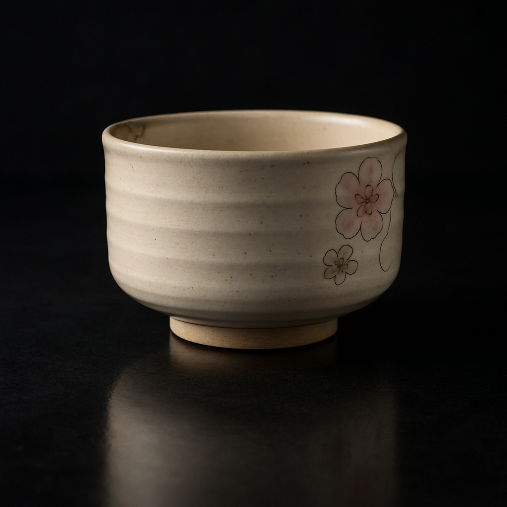
A porcelain bowl painted with such bold greens and purples that it almost shouts. That's Kutani ware (kutani-yaki) — Japanese pottery that refuses to whisper.
When five colors became a philosophy
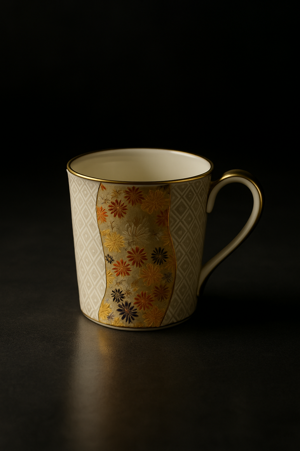
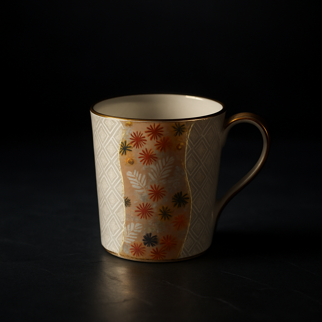
In the Kaga region of Ishikawa Prefecture, craftsmen developed a decorative language unlike anything else in Japan's ceramic tradition. While most Japanese pottery embraced restraint — soft celadons, hushed earth tones — Kutani potters reached for vibrancy. They built their palette around go-sai, the five overglaze colors: green, yellow, purple, navy blue, and red. Not suggestions. Commands.
These weren't timid watercolor washes. Kutani artists applied thick, saturated enamels that pooled and gleamed. Green dominated landscapes. Yellow blazed across backgrounds. Purple and navy outlined birds mid-flight with calligraphic confidence.
The effect? Porcelain that feels alive.
Painted like no one's watching
What makes Kutani ware unmistakable isn't just the color intensity — it's the fearless maximalism. Entire surfaces get covered. A single plate might contain a twisting pine branch, geometric patterns filling the negative space, gold details catching light, and a border dense with repeating motifs. Western eyes sometimes call it "busy." Japanese collectors call it kenran gouka — gorgeous and luxurious.
Kutani potters treated white porcelain not as something precious to preserve, but as a canvas begging to be transformed.
And they weren't afraid of contrast. The aka-e style, for instance, uses red and gold almost exclusively, creating pieces that glow like embers. The ao-e approach leans into greens and yellows, evoking moss-covered temple gardens after rain. Different workshops developed different personalities, but all shared that signature boldness.
Stories you can almost hear
Look closely at Kutani decoration and you'll find entire narratives compressed onto a teacup. Cranes stretching their wings toward longevity. Peonies blooming in impossible abundance. Scholars contemplating mountains. These weren't random pretty pictures — they carried wishes, blessings, philosophical ideas.
The imagery drew from Chinese painting traditions, yes, but Kutani artists rendered them with a particularly Japanese intensity. Backgrounds often disappeared under dense patterns: geometric grids, wave motifs, floral repeats that horror vacui into something hypnotic. Empty space was an opportunity, not a virtue.
Even the painting technique tells a story. Artists worked freehand with astonishing precision, their brushes loaded with enamel that had to be fired at exact temperatures. Too hot, and the colors would burn away. Too cool, and they'd never fully bond. Each piece risked failure right until the kiln door opened.
Living with color
Today, Kutani ware still polarizes. Some collectors find it overwhelming — too much pattern, too much color, too much everything. Others recognize it as a radical act of joy in a craft tradition often associated with minimalism.
The pieces don't fade into your shelf. They announce themselves. A Kutani sake cup transforms a quiet pour into a small ceremony. A decorative plate on a wall becomes a focal point that shifts as light changes throughout the day.
This is porcelain that believes color isn't decoration — it's language. And in Kutani's vocabulary, more is more, and silence was never the point.
The green still shouts. You just have to decide if you're ready to listen.
FAQ
Chaware curates authentic Japanese crafts — straight from the makers in Japan to your table.
Explore the Chaware collection →